Hey, what’s up! Today we’re exploring the world of mobile-first design. In a world dominated by pocket-sized screens, optimizing user experience for smaller displays has become more critical than ever. Let’s break it down into easily digestible sections, so you can level up your design game and ensure your users have a seamless experience on those small, yet mighty, screens.
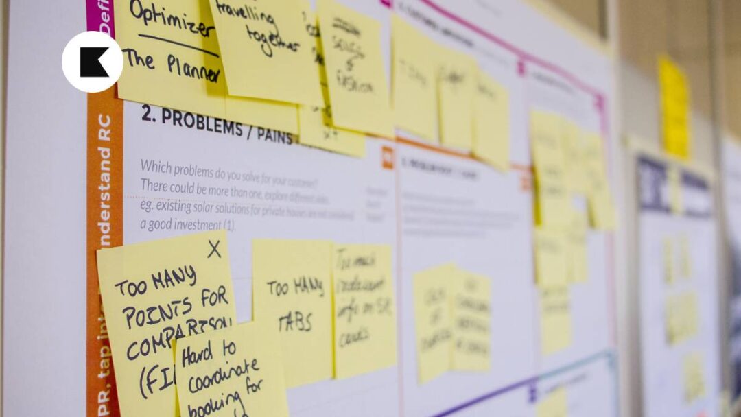
1. Why Mobile-First Design Matters
In a world where our smartphones are practically an extension of ourselves, prioritizing mobile design is so important. Think about it—how often do you find yourself scrolling through your phone, whether you’re waiting in line or lounging on the couch? Users are on the move, and if your design isn’t mobile-friendly, you risk losing their attention.
2. Embrace Responsive Design
One of the key principles of mobile-first design is responsiveness. Your website or app should adapt effortlessly to various screen sizes. No one likes pinching and zooming to read tiny text. Ensure that your design elements, from images to buttons, gracefully adjust to different screens, providing a consistent and enjoyable user experience.
3. Streamline Navigation
Navigating a small screen should be effortless and intuative. Opt for a clean and straightforward navigation menu. Avoid clutter, prioritize essential actions, and consider incorporating a sticky menu for easy access. Users should intuitively know where to find what they’re looking for without feeling lost in a sea of links.
4. Optimize Images and Multimedia
Images and videos are powerful tools for engagement, but they can also slow down your mobile site. Compress images without compromising quality and use efficient video formats. Consider lazy loading to ensure that multimedia elements only load when they come into the user’s view, enhancing both speed and performance.
5. Prioritize Speed
Patience is a virtue, but not in the digital world. Users won’t wait around for your site to load. Optimize your site speed by minimizing HTTP requests, leveraging browser caching, and compressing files. Aim for a load time of three seconds or less to keep your users hooked and happy.
The Roundup
In the fast-paced realm of mobile-first design, putting your users first is non-negotiable. By embracing responsive design, streamlining navigation, optimizing multimedia, and prioritizing speed, you’re not just creating a website or app; you’re crafting an experience. Remember, your users are on the move, so make sure your design can keep up.
As always, thanks for reading. Keep learning, keep growing!
Love My Newsletters? Work With Me
Do you love reading my newsletters? Perhaps we could work together? Here are 3 ways that I can help you.
1. Weekly Newsletter
Every Monday morning you’ll receive the popular KJDADA Newsletter. You’ll get 1 actionable tip on how to design, launch, grow and monetize products that people love.
2. Online Consultancy
Let’s navigate your product management journey together through online sessions and a personalized report and roadmap. I’ll guide you efficiently from A-to-Z while helping you deliver impactful products to the market with confidence.
3. Product Management
At times, your team’s internal resources may be limited in specialist product areas. Partner with me and collectively we can unlock a broader and richer spectrum of product possibilities.