Hey, what’s up! Today we talk about something that might seem a bit technical yet essential for anyone dealing with colors in different mediums – the Pantone Color System.
This is the system that I use for color selection and color management in my design products. It’s not the end-all-be-all system but it’s served me well and that’s why I feel it’s worth sharing.
Now whether you’re a designer, a content creator, or just someone who loves vibrant visuals, understanding how to use Pantone colors to standardize your color palette can make a world of difference. In this quick 3-5 minute read, I’ll break down the process into easy-to-follow steps. So, let’s dive in!
1. Understanding the Pantone Color System
First things first, let’s get acquainted with the Pantone Color System. It’s like a universal language for colors, ensuring consistency across various mediums like print, web, textiles, and more. Instead of relying on vague color names or RGB/CMYK values, Pantone provides a specific code for each color, making it easier to communicate and reproduce exact shades.
2. Choosing the Right Pantone Color
When you’re working on a project, you need to select a Pantone color that accurately represents your vision. Visit the official Pantone website or use design software that supports Pantone libraries to explore the wide array of shades available. You can also consider factors like emotional impact and brand identity when making your choice.
3. Matching Pantone Colors with Different Color Modes
Here’s where it gets interesting. Different mediums use various color modes, such as RGB for screens and CMYK for print. Converting Pantone colors to these modes ensures consistency across different platforms.
- RGB (Red, Green, Blue): If your design will primarily be viewed on screens, like smartphones and monitors, you’ll need to convert your chosen Pantone color to RGB values. This will help maintain the intended color when it’s displayed digitally.
- CMYK (Cyan, Magenta, Yellow, Key/Black): For anything that will be printed, such as business cards or posters, Pantone colors need to be converted to CMYK. This conversion takes into account the subtractive nature of printing and ensures your color looks just as vibrant on paper as it does on screen.
4. Using Pantone Color Swatches
Design software often provides Pantone color libraries, making it easy to pick and apply your chosen color. These swatches are pre-converted to different color modes, saving you the hassle of manual conversion. Just search for the Pantone code, and the software will do the rest.
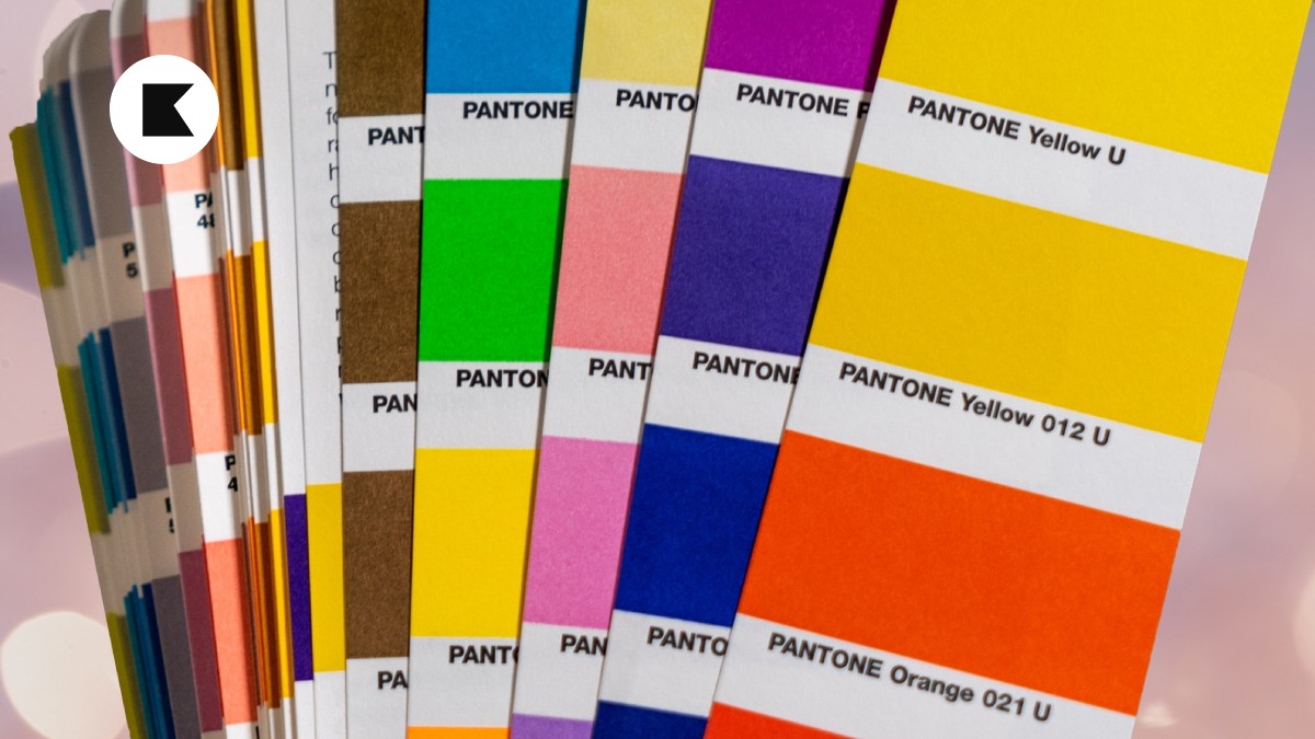
5. Investing in Physical Pantone Color Charts
For those who are truly dedicated to precision in color selection, there’s another tool that can significantly enhance your design process – physical Pantone Color Charts. These are tangible collections of color swatches that allow you to see the exact colors in person, without relying solely on digital representations.
Here’s why investing in physical Pantone Color Charts is worth considering, especially if you’re serious about design and need to select colors as part of your day-to-day job:
- Accurate Color Representation: While digital screens and even printed proofs are helpful, physical color charts give you a hands-on experience. You can see how light interacts with the colors in different lighting conditions, helping you make more informed decisions.
- Enhanced Creativity: Having a physical color chart at your disposal can spark new ideas and creative choices. The tactile experience of flipping through swatches might lead you to consider color combinations you hadn’t thought of before.
- Consistency Across Projects: When you’re working on multiple projects, having a physical Pantone Color Chart ensures consistent color selection. You won’t have to rely on memory or digital references that might not be accurate across various platforms.
- Client Presentations: If you’re presenting design concepts to clients, having a physical color chart adds a level of professionalism. Clients can see and touch the colors, making it easier for them to visualize the end result.
Investing in physical Pantone Color Charts might be quite pricey (PGK200+ thereabouts), but it’s an investment in your design toolkit that can pay off in the long run. It’s a valuable resource for anyone who needs precise and reliable color selection in their work.
6. Print Tests and Screen Checks
Before finalizing your design, it’s crucial to test how your chosen Pantone color looks in both print and on screens. Print a sample or check a proof to ensure that the CMYK conversion accurately represents the intended shade. Similarly, view your design on multiple screens to verify that the RGB conversion is on point.
Conclusion
Using the Pantone Color System might seem like a minor detail, but it can have a massive impact on the final outcome of your designs. By understanding how to choose, convert, and implement Pantone colors across different mediums, you’re setting yourself up for visually stunning and consistent results.
As always, thanks for reading. Keep learning, keep growing!
Love My Newsletters? Work With Me
Do you love reading my newsletters? Perhaps we could work together? Here are 4 ways that I can help you.
1. Weekly Newsletter
Every Monday morning you’ll receive the popular KJDADA Newsletter. You’ll get 1 actionable tip on how to design, launch, grow and monetize products that people love.
2. Online Consultancy
Let’s navigate your product management journey together through online sessions and a personalized report and roadmap. I’ll guide you efficiently from A-to-Z while helping you deliver impactful products to the market with confidence.
3. Product Management
At times, your team’s internal resources may be limited in specialist product areas. Partner with me and collectively we can unlock a broader and richer spectrum of product possibilities.
4. Brand, Website & Email Management
Three important products that any business needs is a quality brand, a quality website and professional email services. Let’s have a chat and explore exciting possibilities together.